
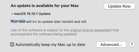
I’ve added this disgrace to my list of how not to create a dialog. The text is incomplete and the hidden link unclickable. What a mess.
I’ve added this disgrace to my list of how not to create a dialog. The text is incomplete and the hidden link unclickable. What a mess.
Did you ever forget your chip & pin card in a card reader? Leave the original on a photocopier? Send an email to the wrong person from your address book? The way technology is designed can make errors more or less likely. Most everyday examples are just annoying; if a pilot or a nurse makes similar errors in the course of their work, the consequences can be much more serious. This talk discusses some of the causes of these errors and how the design of technology can provoke or mitigate them.
I’ve been quickly reading some of Professor Blandford’s work in preparation for my talk on thematic analysis and affinity diagrams on October 3rd. The above video was a bit of a diversion from that; diversions often occur when preparing most talks on what I consider somewhat dry topics.
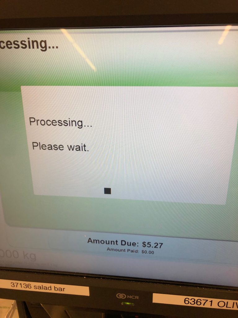
Processing, processing. Love the IT admin stickers on the screen.
This is a quick shot I took with my phone while I was trying to purchase a bottle of milk and jar of yogurt at the Stratford Sobey’s. The experience was terrible and required 2 attempts on my part. The context of this particular picture was when I had finally gone through a series of extremely complex screens, full of icons which match nothing from my world, and I was attempting to pay. Apparently there was an error on the interact terminal of some sort, the fact of which I didn’t know except that the attendant told as such, and the screen above was in some kind of loop until it received a message that the payment was not processed. I have a tendency to exaggerate, but it’s a complete garbage implementation. If you like usability heuristics, it’s fun to see how it violates: 1) Visibility of System Status, 2) Match between system and the real world, 5) Error Prevention, and 9) Help users recognize, diagnose, and recover from errors. The role of the attendants that work beside these terminals is not to guide new users through an unfamiliar system but to diagnose errors, fix the systems when they inevitably break down, and help people complete their purchases when the look of utter confusion sets in.
It’s taken me months to get used to the door at the exit to the parking garage on Queen street.
I’m going to call this a serious bug because like so many things that Apple is doing lately it breaks their HIG and basic usability heuristics.
In a discussion on severity ratings at a recent meetup in Charlottetown I mentioned how an increasing amount of non-severe ratings add up to cause harm to a customers experience with a product, but it’s difficult to get buy in (for change) from stake holders, as when viewed alone these are minor issues. I think Steven Garrity described as “death by a thousand cuts”. I wouldn’t characterize the issue I am having as minor, but many of the problems I see with Apple’s UI are, but collectively they show that usability is not the priority in once was.
In my “work” directory I sort all folders by date modified. This allows me to have the most immediate projects, files, and such always at the top. I find this reduces my cognitive load when having to think of names or by sorting alphabetically. This has worked for me for years, I’m sure is an accepted and common method for others, and is respected by every service I have used. Except for iCloud. I use this scheme through-out MacOS, with the exception of the downloads folder which I sorted by Date Added.
I wrote recently that I was running out of space on iCloud and Google Drive hadn’t synced properly for months. Despite getting some great suggestions I dropped Google Drive and went with iCloud for all my work files, until I could spend more time with the suggested alternatives.
But what iCloud did is change all the modification dates on all the top-level folders within the directory to the upload to iCloud date. Ok, I guess they were technically modified. It’s confusing, much in the same way that opening a file can change the modified date (because often opening a file changes some meta-data). Few understand these nuances of course.
What makes this worse is that despite working on files within the folders, the folders modification date does not reflect that some file or folder within has been modified or something added. This may or may not be now technically correct, but it is absolutely different from the behaviour you have elsewhere throughout the MacOS and different from what I have read in the HIG. The modified date on a folder represents not just the folder itself but what is contained within (changing the folder name does change the modification date). Dropbox respects this, Google Drive does, and in fact I’ve never seen another service not. So as result this behaviour is inconsistent and does not match the users mental model, resulting in confusion, moderate frustration, and a poor experience.
Perhaps the excuse is that this is simply iOS design principles spreading to the Finder, in iOS you are supposed to downplay file handling as much as possible. Whatever the reason, it’s a mistake and wrong.
When discussing user research and testing recently I blanked out on the actual reasons why I don’t use the same number of participants that people with marketing backgrounds are convinced they need. Generally I schedule 6 – 7 in case a session goes awry but otherwise my reasons for using limited participants mirror those below:
The five user number comes from the number of users you would need to detect approximately 85% of the problems in an interface, given that the probability a user would encounter a problem is about 31%. Most people either leave off the last part or are not sure what it means. This does not apply to all testing situations such as comparing two products or when trying to get a precise measure of task times or completion rates but to discovering problems with an interface. Where does 31% come from? It was found as an average problem frequency from several studies
Why You Only Need To Test With Five Users

I generally don’t spend much time managing my large collection of ebooks in Apple “Books” but today as I decided to create some semblance of order, I realized that you can delete category names without confirmation.
In my perhaps old school experience with usability all destructive actions should be accompanied by a confirmation dialog. If I had deleted the category in error, then all of my work categorizing would have been in vain, resulting in user frustration and a poor experience. Incidentally, the undo button doesn’t work either (though the menu will flash, indicating that they action was registered). This is not software design at it’s finest.
Update: This behaviour is only exhibited when their are no items in the category or you have checked the “Do not ask me again” item. So not as big a deal as I had previously imagined.
For all of Jacob Neilson’s work I have read, and some of the first literature I read of his was early journal articles was some 19 years ago, I don’t remember having seen or heard him do a presentation. The above is a talk he gave at Google in 2013.
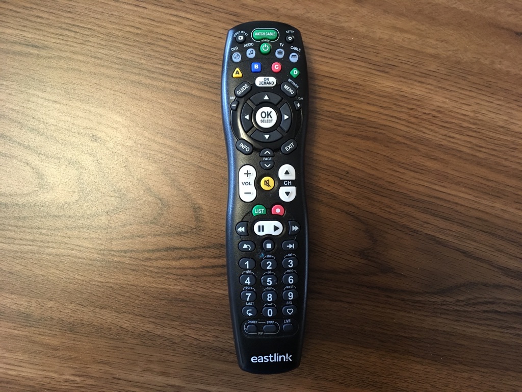
Cable operators remote controls haven’t improved much if at all.
A bit of light hearted geek fun during an otherwise emotional experience.
Over the winter I had the good fortune of being able to spend time caring for my mother while she was in palliative care. This excellent facility included many of the comforts of home, not least of which was a large screen television hung in a good viewing location in each guest room. I forget the brand but the TV had all the features that (not)smart televisions have now, features hidden and largely inaccessible to those not willing to commit to a large learning curve. Naturally, a good TV plays an important part in each guests time in the facility. Unfortunately the remote control only seemed to add frustration and increased work load for the volunteers and nurses.
Remote controls with bad UI is still a common issue.
Without fail each and every time my mother would want to watch TV she would be unsuccessful and hand the remote to me to try to fix the problem. I can’t figure this thing out she would say. I must have played with this remote for a week before I could make sense of what I was supposed to do to turn on the TV.
I wasn’t alone, with the exception of the nurses, the only way anyone could get the TV to show a TV show was by sheer luck.
After I figured it out, I decided to do little experiment. A discount usability test of a single task – turn on the TV to cable channel 5. Feigning ignorance I asked 7 visitors of various ages and perceived skills to complete the task. None of the participants were from the nursing staff as they, after repeated requests to perform the same task, had mastered the system. 6 participants are a common requirement for any test, with 1 extra in case their were issues with a participant and to provide a good practice run.
Afterwards I asked to explain how they accomplished the task, which would illustrate task flow.
The results were unsurprising. All had trouble with the remote. Most, (4 out of 7) gave up before completion and asked someone else for assistance. The remaining succeeded in turning on the TV and turning to channel 5 but did so entirely by luck so couldn’t recite the path they took to get there.
The problem is that remote control forces a specific button press sequence in order to accomplish the task (watch cable TV channel 5) but does not illustrate this requirement. Most people press the large green button with the text “watch cable TV”, but you must first press the smaller power button first. If you don’t the screen is active but you begin your hunt through the myriad of other similarly labeled buttons, all to no avail.
The fix is to properly label the sequence, with text and correct button size, or ideally, remove the need for a 2 button press for what is the most common function by combining these two actions into 1.
There are three keys to unlock the door to usability: frequency, sequence and importance.
Frequency says that things the customers do most frequently (e.g. next, back, search etc) should have a prominent position in the sequence.
Sequence says that activities that occur in sequence should be presented in sequence (i.e. you pay at the end of a transaction, not in the middle).
Importance means that important pieces of information need to be given clearly and at the right time (e.g. if you only ship within the EU, then a customer trying to buy from India needs to know this early on –not at the end of a six-page check-out dialogue).
Understanding the customers’ mental model and applying the frequency, sequence and importance rule will crack most of your usability needs. But, beware, like all rules, you cannot follow them blindly, and there are always tradeoffs that have to be made between these elements.
This is Service Design Thinking
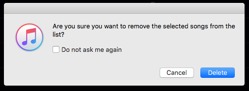
Oops iTunes UI team. There is a questionable label in your dialog. Which action are we taking here? Are we removing the song or are we deleting the song? Deleting implies deleting the song all together, which may cause some confusion amongst users, especially since many no longer read the instructions above the button area at all.
It’s more efficient and effective to give users a button that’s labeled with the specific action (vs. the exclamation OK), but that label itself must agree with the action.
Perhaps with the major redesign coming to iTunes in the fall, Apple will fix this inconsistency.
Further, why is songs plural when I only selected a single song?
Quick snapshot with my iPhone
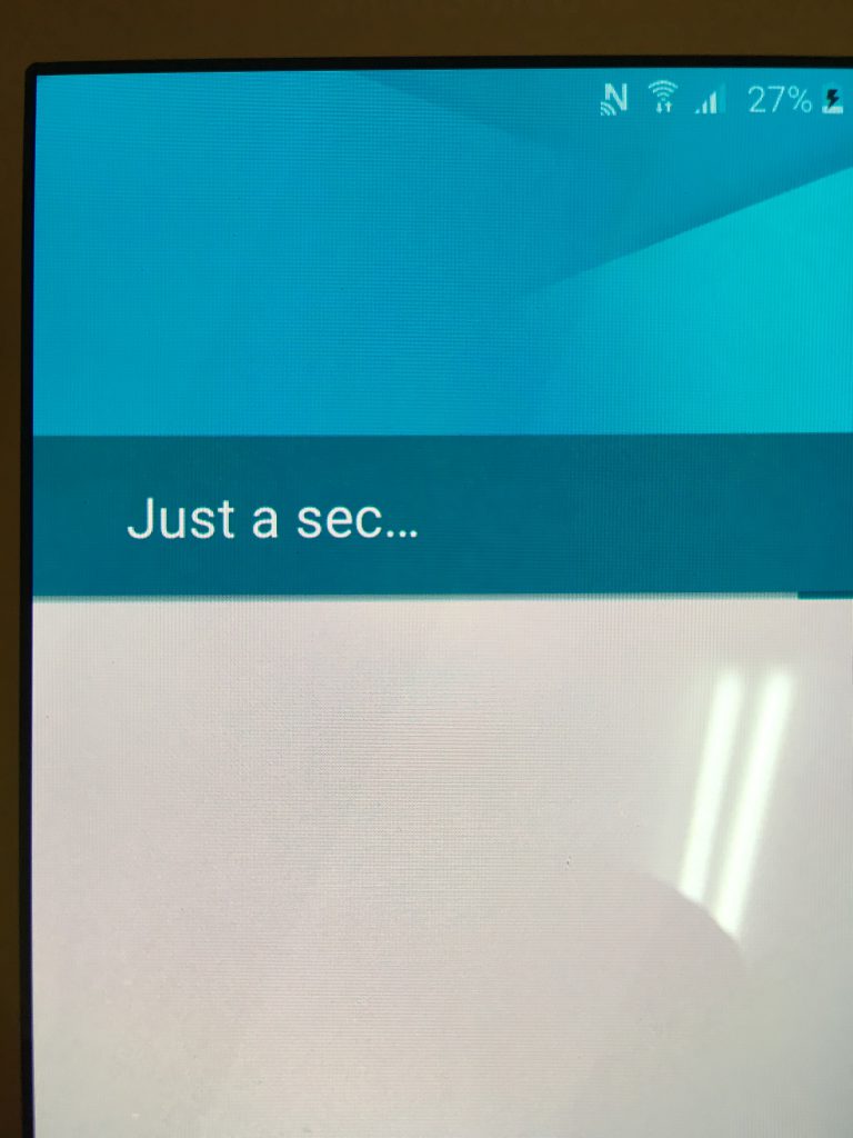
Other than studying material design I’m new to the Android experience. When I was setting up my sons new phone the above dialog appeared.
“Just a sec… “ seems to be an incredibly odd choice for a waiting dialog copy. Seems out of place and too informal. Doesn’t strike me as friendly, nor is it particularly clear, especially for English as a second language users. And the waits were always much more than a second.
“Usability is strongly tied to the extent to which a user’s mental model matches and predicts the action of a system. Ideally, an interface design is consistent with people’s natural mental models about computers, the environment, and everyday objects. For example, it makes sense to design a calculator program that has similar functionality and appearance to the physical hand-held calculators that everyone is familiar with”.
Via Mental Models and Usability. Mary Jo Davidson, Laura Dove, Julie Weltz

It’s easy to see why there is often push-back on the results of usability tests (nobody likes to be told why their solution doesn’t work), but it’s important to remember that the goal is the same for everyone on the development team: to constantly improve the products we design. Effectively communicating usability results is one step towards designing better products. Via.
Having a standard process for defining severity means that you can be consistent in the way you assign severity and means that you provide the transparency needed for people to check your work. With an expert review,
deciding on the severity is more a matter of judgement, but there are three questions you can ask to improve your objectivity.
From David Travis a concise set of questions to help assign a rating:
Does the problem occur on a red route?
Red routes — frequent or critical tasks — are the most important tasks that the system needs to support, by definition.Is the problem difficult for users to overcome?
Some usability problems are show-stoppers: users just can’t proceed.Is the problem persistent?
Persistent problems — problems that keep cropping up — are more severe because they have a bigger impact on time on task and on customer satisfaction.
The complete article: How to prioritise usability problems
More views:
Heuristic Evaluation Quality Score (HEQS): Defining Heuristic Expertise
Rating The Severity Of Usability Problems
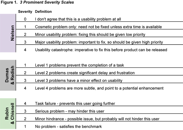
20 years ago Jacob Neilson in his article Severity Ratings for Usability Problems outlined the following 5 point scale:
0 = I don't agree that this is a usability problem at all

1 = Cosmetic problem only: need not be fixed unless extra time is available on project

2 = Minor usability problem: fixing this should be given low priority

3 = Major usability problem: important to fix, so should be given high priority

4 = Usability catastrophe: imperative to fix this before product can be released
Problem Prioritization in Usability Evaluation: From Severity Assessments toward Impact on Design
Effectively Communicating Usability Problems
UXValue as a tool for prioritize bugs
Making sense of usability findings with criteria based severity ratings
I’ve been doing allot review/reading lately, visiting dog-eared old books, and looking through my Evernote bucket for tidbits of user experience wisdom. I came across this list of 34 maxims (this format was at one time particularly popular) created by Arnold Lund. I find lists like this particularly useful for mapping to past learning and experience. Created in 1997, it’s still as relevant today as it was then, and it serves as a useful reminder and a great guide for future work.
Reference: Lund, A M (1997) “Expert Ratings of Usability Maxims.” Ergonomics in Design: The Quarterly of Human Factors Applications, Volume 5, Number 3 (July) pp. 15-20.
Brief demonstration illustrating how they carry out usability research in the labs at Amberlight.
Have you ever wondered what would happen if you did a usability test on fruit?
Author Steve Krug’s demo test as a companion piece to his latest book, Rocket Surgery Made Easy: The Do-It-Yourself Guide to Finding and Fixing Usability Problems. The main purpose for creating this video is to demonstrate how easy and simple usability testing can be.
In this video, Julie Blitzer covers the basics of writing a usability test script, finding test subjects, and interpreting results.
Performing a usability test early in your website planning process can have huge returns – a paper prototype allows you to do this with a minimal time investment.

World Usability Day may have come and gone but the posters will last as a visual statement of what life might be like without it (it being usability). The examples are good but one only needs to look at almost any device today and see serious problems. I do think they work well.
The idea behind the 2006 campaign was to build an appreciation for usability by showing what life might be like without it. This was demonstated by visually removing or changing elements of everyday objects and consequently rendering them unusable.
More images from the posters after the jump.

Great ad placement Businessweek! Thankfully I can still see the printer friendly page, which is mislabeled. It should be labeled reader friendly. I can understand the need to display ads – I display some adsense ads which cover my hosting costs – but must they be so reader hostile?
One thing that is missing from this screenshot is a fly over ad which covered even more of the viewable area. Do these tactics really work in the long run?
As appears in Firefox and safari.

For ages we have ignored the bottom or footer section of our screen designs. We bought into and never lost the notion that the only part of the screen that had any value was the first view and that anything below the fold was seldom read. For the most part that has been disproved but old habits die hard – just look at the footer section of this webblog as evidence.
In the last year or two I have seen a increasing number of sites using this part of the screen to in corporate all kinds of different data. But this example must certainly be the most “bottom heavy” or have the greatest density of data I have seen on any site to date. At approximately 950px in height it certainly is visually impressive. Outside of the obviously performance penalties, and this particular site tends to be on the slow side, I wonder what the positive or negatives of this kind of approach could be (this same wayfinding footer is on every page)? Looks like a good candidate for some testing.
Found at Forumosa.com
Luke Wroblewski writing for UX Matters:
After forms, data tables are likely the next most ubiquitous interface element designers create when constructing Web applications. Users often need to add, edit, delete, search for, and browse through lists of people, places, or things within Web applications. As a result, the design of tables plays a crucial role in such an application’s overall usefulness and usability. But just like the design of forms,there’s more than one way to design tabular data.
“With more advanced services rolling out across the planet, ease-of-use is becoming crucial to their success, but today’s user interfaces aren’t quite cutting it. Solving that will be a complex task, but the place to start is the users – not just by asking them what they want in future, but what they’re doing with their handsets now
As the mobile industry moves toward more advanced non-voice services, from MMS and instant messaging to mobile TV and video calls, the underlying mantra for manufacturers, operators and apps developers alike has been a strikingly contradictory one: offer simple, easy-to-use services using mind-bogglingly complex technology. That means shielding the user from all that state-of-the-art wizardry behind the scenes, and making any new service appear as though it’s so simple even your Luddite great-uncle could figure it out – ideally without once having to consult a manual.”
Read: Usability: it ain’t easy – Telecom Asia. Via Putting People First
Caroline Jarrett’s 2 rules for labeling buttons (found via elearning post):
“The consequence of the two rules may be that you end up with buttons with labels that are longer than a single word. I think that’s much better than striving for single words that are either confusing … or infuriating ….”
I’m a bit behind in hitting my usual reading material haunts but from my favourite web development magazine comes this fine article:
“Computers are supposed to make our lives easier, not more difficult. As usability-conscious designers, we can make our users’ lives easier by thinking about the way people interact with our websites, providing clear direction, and then putting the burden of sorting out the details in the hands of the computers—not the users.
It’s that last part that we’re going to focus on here. We’ve all heard and read about big usability mistakes time and time again: “Don’t use images or flash for navigation,” “Don’t use Javascript for links,” and I certainly hope we’re all applying those lessons in our work. It’s often the smallest usability quirks, however, that create the biggest annoyances for users, especially when it comes to HTML forms. Follow these guidelines, and you’ll be off to a good start.”
Which bag is it easier to find things in?


I have been spending an inordinate amount of money on bags since my days as a musician when it was vogue to have the newest gear to carry your instrument. I have more bags lying around my place than I care to admit. Bags to carry cameras and laptops, day bags, overnight bags, walking bags, hiking bags, suit bags, camping bags, and on and on and on. Having seen and used so many bags over the years I have come to see the same mistake being made time and time again. And though it may seem petty, I do believe that it’s the little things that help build a good product and ultimately customer loyalty.
This mistake is the most simple imaginable. Make the interior of the bag bright so you can actually see what you are searching for. Black bag interiors make it almost impossible to see inside the bag.
I bought a fancy camera bag last week and this didn’t really hit home until I tried putting my camera inside it’s cramped confines. It’s difficult as heck to guide the camera into the bag without some visual clue as to where it is going. Finding some small items inside has proven frustrating as well. All the other bags I use on a regular basis have highly reflective interiors which allow me to see inside quite easily.
A bit of user centered design goes a long way to improving a product. Ask a few questions and watch people use your product under normal circumstances. It doesn’t take much time, effort, or money but the results can be “illuminating”.