Dieter Rams’ 10 Principles for Good Design

dieter-design

I’ve always been drawn to maxim’s such as these, maxim’s that remind us of the ideal.

  1. Good design is innovative: The possibilities for innovation are not, by any means, exhausted. Technological development is always offering new opportunities for innovative design. But innovative design always develops in tandem with innovative technology, and can never be an end in itself.

  2. Good design makes a product useful: A product is bought to be used. It has to satisfy certain criteria, not only functional but also psychological and aesthetic. Good design emphasises the usefulness of a product while disregarding anything that could possibly detract from it.

  3. Good design is aesthetic: The aesthetic quality of a product is integral to its usefulness because products are used every day and have an effect on people and their well-being. Only well-executed objects can be beautiful.

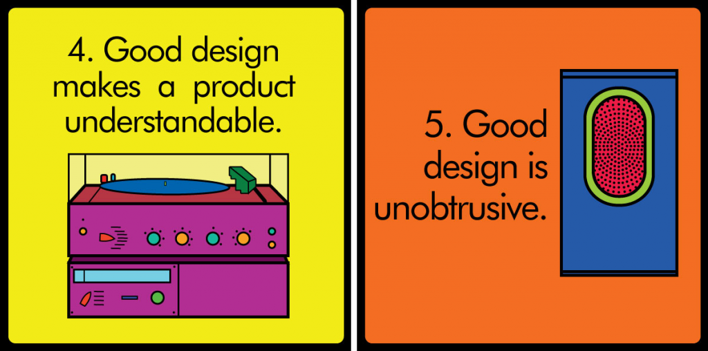
  4. Good design makes a product understandable: It clarifies the product’s structure. Better still, it can make the product clearly express its function by making use of the user’s intuition. At best, it is self-explanatory.

  5. Good design is unobtrusive: Products fulfilling a purpose are like tools. They are neither decorative objects nor works of art. Their design should therefore be both neutral and restrained, to leave room for the user’s self-expression.

  6. Good design is honest: It does not make a product more innovative, powerful or valuable than it really is. It does not attempt to manipulate the consumer with promises that cannot be kept.

  7. Good design is long-lasting: It avoids being fashionable and therefore never appears antiquated. Unlike fashionable design, it lasts many years – even in today’s throwaway society.

  8. Good design is thorough down to the last detail: Nothing must be arbitrary or left to chance. Care and accuracy in the design process show respect towards the consumer.

  9. Good design is environmentally friendly: Design makes an important contribution to the preservation of the environment. It conserves resources and minimizes physical and visual pollution throughout the lifecycle of the product.

  10. Good design is as little design as possible: Less, but better – because it concentrates on the essential aspects, and the products are not burdened with non-essentials. Back to purity, back to simplicity.

via Design Legacy of Dieter Rams


Interesting interview by Om Malik:

Om: If you were to give advice to younger designers, web developers, web app makers, what would you tell them?

Erik: Learn as much about our culture as you possibly can, by reading, by traveling, by involving yourself in things that go on. But don’t become an artist. Don’t think, “I’ll do it intuitively.” You have to learn if not to code at least to appreciate code, to understand code. Because code is what nuts and bolts were a hundred years ago.

If you don’t know anything about mechanics, you can’t survive in this world. If you don’t know anything about how a computer works or code works, as a communicator, which is what a designer is — the interface between machines and man, that’s what we are. We are the interface, we interpret what the machine says into visible language. If you don’t understand how the machine works, you’re going to be laughed out of the room by the engineering guys, because you can’t communicate with them.
Find the full text here


Inconsistency causes confusion, because things don’t work the way the user expects them to. Forcing users to memorize exceptions to the rules increases the cognitive burden and causes resentment. Attention to consistency is important for instilling confidence in the product, because it gives the impression that there is a logical, rational, trustworthy designer behind the scenes.

For desktop and mobile applications, you should aim to understand and conform to the user interface guidelines for your operating system or platform. Consistency with these standard conventions reduces the number of new things a user needs to learn. Donald Norman


Dialog boxes

Perhaps due to the influence of Windows based software poor UI design, I often come across the common mistakes superfluous and poorly thought out dialog boxes. In addition to the maxim below, I believe we should avoid creating error dialogs when an undo will do. Unfortunately the essential undo function is still often forgotten.

Dialog boxes should be action-oriented; they should help guide users towards what their next step is likely to be and it should provide them with the information that they need in order to be able to accomplish that next step.


Discoverable UI

WordToolbars

Discoverability is one of the distinct advantages of the GUI, and lately I’ve found it to be an often fought for concept. There is a trend in the UI I see lately to either hide all functions in places most users would not easily find, or obscure them behind difficult to recognise icons. But this wonderful discoverability of the GUI has a dark side when you bring all of the possibilities to the forefront, which is often the strategy with Windows UI, you run the risk of leaving no work space for the user or turning your productivity app into nothing but a large piece of chrome.

In the exaggerated example above, is this interface discoverable? Certainly! All of the functionality is right there. But you pay a cost in terms of screen real estate.


My design and user experience reading list

For years I kept a running list of work related reads to share with colleagues and friends. It gradually got replaced with various online services and then predictably forgotten. Years ago I used to be an avid reader of everything related to working within a design team, most of my initial UX/design knowledge was largely from these books, though many of those books might be dated today I have started to keep a new list in my “books” page linked above. I think it’s a good reading list for interaction designers, information architects, usability professionals, product managers and designers. They are listed in no particular order (and unfortunately broken in mobile).

Design and user experience reading list


Where to find ideas

“The trick to finding ideas is to convince yourself that everyone and everything has a story to tell. I say trick, but what I really mean is challenge, because it’s a very hard thing to do. Shampoo doesn’t seem interesting? Well, dammit, it must be, and if it isn’t, I have to believe that it will ultimately lead me [to something] that is.” “The other trick to finding ideas is figuring out the difference between power and knowledge. You don’t start at the top if you want to find the story. You start in the middle, because it’s the people in the middle who do the actual work in the world. My friend Dave, who taught me about ketchup, is a middle guy. He’s worked on ketchup. That’s how he knows about it. People at the top are self-conscious about what they say (and rightfully so) because they have position and privilege to protect — and self consciousness is the enemy of ‘interestingness.’” “In ‘The Pitchman’ you’ll meet Arnold Morris, who gave me the pitch for the ‘Dial-O-Matic’ vegetable slicer one summer day in his kitchen on the Jersey Shore: ‘Come on over, folks. I’m going to show you the most amazing slicing machine you have ever seen in your life,’ he began. He picked up a package of barbecue spices and used it as a prop. ‘Take a look at this!’ He held it in the air as if he were holding up a Tiffany vase. That’s where you find stories, in someone’s kitchen on the Jersey Shore.”
What the Dog Saw – Malcolm Gladwell


Why are Mental Models Important to Usability?

“Usability is strongly tied to the extent to which a user’s mental model matches and predicts the action of a system. Ideally, an interface design is consistent with people’s natural mental models about computers, the environment, and everyday objects. For example, it makes sense to design a calculator program that has similar functionality and appearance to the physical hand-held calculators that everyone is familiar with”.

Via Mental Models and Usability. Mary Jo Davidson, Laura Dove, Julie Weltz


Real world design is often iterative – fail fast so you can succeed sooner.

Failing fast is one of those seemingly overly simplistic tenets that I often fail at achieving. Balancing perseverance (stubbornness) and the realisation that through failure we learn or succeed is often difficult to achieve.


In many ways, the most creative, challenging, and under-appreciated aspect of interaction design is evaluating designs with people. The insights that you’ll get from testing designs with people can help you get new ideas, make changes, decide wisely, and fix bugs.


To design is much more than simply to assemble, to order, or even to edit; it is to add value and meaning, to illuminate, to simplify, to clarify, to modify, to dignify, to dramatize, to persuade, and perhaps even to amuse.
Paul Rand


Sunk Cost Effect

We’re reluctant to pull out of something we’d put effort into.

When we put time and effort into something, we’re motivated to make it work. We therefore often continue to invest into it even if it brings us losses. Examples include continuing to pump money into a failed business idea, or attending a play when sick only because the tickets were pre-purchased. Arkes, Hal R., and Catherine Blumer, “The psychology of sunk cost”, Organizational Behavior and Human Decision Processes, Vol. 35, No. 5, December 1985, 124-140.

This characterises so much of my behaviour, from continuing to invest in Chinese studies, despite seldom needing anything above a very rudimentary level, to continuing to doggedly insisting on being an entrepreneur, despite not possessing the required capital, human or otherwise (I suppose continuing to live in Taiwan counts too).

Via Cognitive lode


井井 identity

井井咖啡館

I saw this little café near Hsinchu MacKay Hospital yesterday and couldn’t help thinking how much more effective their identity would be if it worked it’s way down to the waffles they serve inside. The Chinese character is close, but I guess they either didn’t think of it or custom waffle irons proved too expensive.

井井咖啡店


How To Think Like An Architect: The Design Process


This same thought process is used with Interface Design as well.

Santa Barbara architect Barry Berkus takes us through the process he used to design the Padaro Lane Residence in Southern California. He demonstrates his conceptual design process through a series of raw drawings and diagrams, along with a detailed explanation of the site conditions, and client needs. This preliminary diagramming stage is a necessary first step in creating a functional, and well thought out design.


WriteBoard

WriteBoard is a Wi-Fi-connected Drawing Board that retrofits the classic Whiteboard to allow Seamless Sharing & Syncing between Devices.

We worked on a concept quite similar to this while at CL a few years back, ours had a business focus and was planned to work on a much larger surface but the working concept is much the same. Great to see someone trying to take the idea through to execution.


Business and industry have learned that their products ought to be aesthetically pleasing. A large community of designers exists to help improve appearances. But appearances are only part of the story: usability and understandability are more important, for if a product can’t be used easily and safely, how valuable is its attractiveness? Usable design and aesthetics should go hand in hand: aesthetics need not be sacrificed for usability, which can be designed in from the first conceptualisation of the product.
Donald Norman, The Design of Everyday Things, Doubleday, 1988


好的設計

令人困惑、混亂的設計,都是失敗。好的設計不但是人們欣賞產品的情感紐帶,亦且於無形中引導人們成功完成一些具體的任务。有意識地從人類的認知和情感層次上設計,會幫助我們更好地提供令人滿意和愉快的用戶體驗。


Colour and Contrast

IMG_8448.JPG

Despite the weathered type, there is no mistaking the location and meaning of the device in the photo above.

Warm colours take control, we use them for things you want to pop out and get noticed. Colours like red are especially good for this purpose. Some colours have universal meaning, but some do not. Higher contrast items stand out and catch your eye, the white background above is very effective. The same red box placed on a red brick background is less effective, a problem I often see.

This is very basic knowledge but it’s consistent application requires a discipline I don’t often encounter in my day to day environment.


Robert Brunner: What All Great Design Companies Know

We emulate the design acumen of companies like Apple and BMW, but what are the processes and mindsets that make them tick? In this 99U talk, designer Robert Brunner deconstructs his creative process revealing the stories behind products like Beats by Dre headphones and the Polaroid Cube.
First, he says, recognize that a brand belongs to your customers. “You don’t own your brand. A brand isn’t a logo or packaging,” he says. “It’s a gut feeling. And when two people have the same gut feeling, you have a brand.” Secondly, most people view design as a part of the production chain, you get requirements in and out comes a product. But design is the chain, and for the best products it permeates every step. “It should be a topic of conversation constantly,” he says. “Thats how you make great stuff.”


Timbre Speaker

Timbre Speaker by young designer Casey Lin.

“Timbre Speaker trims the essence of a speaker down to the very bare minimum, allowing the inherent qualities of the materials to become the centerpiece of the design. All superfluous detail is stripped away, leaving only the necessary audio and power ports at the rear, and combined power and volume dial. Wood and glass were selected for their favourable acoustic qualities which enhances the audio experience of the user. The Black American Walnut wood adds a warmth to the tone, while the addition of the glass vessels bring a more reverberant characteristic to the music.

Surface transducers are mounted on the interior of the wooden box, vibrating the surface and turning the box into a speaker. The glass vessels act as physical equalizers, where the vibrations transfer through the wood into the glass and changes the timbre of the sound. The wooden box can act as a standalone speaker, or alternatively, vessels of other material, size or shape can be placed on the speaker to change the sound according to the users taste.

Timbre Speaker has an elegant, yet playful feel to it, users are encouraged to experiment with different objects and placements to find the timbre they enjoy the most.”


How to Design Social Experiences


Facebook’s Global Head of Brand Design, Paul Adams, on the complex task of designing social experiences.

The web is evolving, orienting around people rather than content. As a result, almost all UX professionals will increasingly need to design social experiences. Designing interactions between people is different from designing user experiences. For example there is often no clear task to design for, no set user goal, and no clear outcome.

To complicate matters further, people’s sense of identity and the social interactions they have with others are subtle and nuanced. This means you can never predict how people will respond to what you create for them. Not only does this uncertainty mean that we need a very different approach to product development to be successful, it means that we need to be ready to iterate in real time – to change what we have launched almost immediately after we have launched it.

Paul will talk about the social design process, how it differs from classic user-centred design methods, and will explain why he thinks UX professionals will need to change how they work to be successful in the future.


In most people’s vocabularies, design means veneer… to me, nothing could be further from the meaning of design. Design is the fundamental soul of a man-made creation that ends up expressing itself in successive outer layers of the product or service. Steve Jobs in a Fortune magazine interview

I spent half my time as a designer trying to overcome the design as veneer fallacy.


For most of the 20th century, professional designers had a clear project in view. Modernism was the order of the day, and functionality, simplicity and innovation were unquestioned virtues. Today things are messier. We have become more aware that different people around the globe want and need different things. Style cults come and go so quickly that keeping track of them is an industry in its own right. Progress itself is coming to seem a dubious prospect, given contemporary debates about the environment and the increased appreciation of traditional culture. These days who is to say what constitutes good design? Glenn Adamson enjoys a rapid-fire and illuminating ode to contemporary design


Connecting to your loved ones around the world at the flick of a switch!

3de48f902c7c0ab3a1a42cf06ce0f66e_large

The Good Night Lamp is a family of internet-connected lamps. Turn the Big Lamp on and the Little Lamps turn on wherever they are.

Keeping in touch with people has gradually become more than being “always on, sometimes off”. We would like to think that people can share parts of their lives with their families & loved ones in more subtle ways with the flick of a switch. A physical social network.

Good Night Lamp


Apple ‘baby mac’, 1985

baby mac
Hartmut Esslinger, Apple ‘baby mac’, 1985

Simply beautiful piece of work – like all good design it still feels fresh and inviting today.

… it could be as radical as possible – and that nade it the best kind of challenge.
concept A and B were well founded in proven statements, so concept C was my ticket for a voyage toward
a mysterious destination. it would also become the winner. (…)

From Hartmut Esslinger’s early apple computer and tablet designs (Designboom)


Impress – flexible display

Impress is the deliverance of the touch screen from its technical stiffness, coldness and rigidity. It breaks the distance in the relationship of human and technology, because it is not any longer the user which is subjected to technology, but in this case the display itself has to cave in to the human. Impress is a chance of approach of user and technology, above all, from technology.
It is a matter of a flexible display consisting of foam and force sensors which is deformable and feels pleasantly soft. Impress works with the parameters position and time like other touch screens as well, but in addition to that, it reacts, above all, on the intensity of pressure.

Impress was developed by Silke Hilsing, a student at the department Design of the FH-Würzburg (Germany). No revolutionary tech. but good execution.


The hope of good design

The hope of good design lies in those designers who believe in what they do and will only do what they believe … Contrary to hearsay, it is possible to make a living that way. -Alexander Girard