I walk around the campus where I work and see a vibrant mix of races and cultures. Every one of those people has a different voice … a different perspective … a different story to tell. All of that makes our company an exciting and special place to be, and allows us to do great things together. We are urgently working to become much more diverse, because it’s so important to our future success. I firmly believe that whether you’re building a company or leading a country, a diverse mix of voices and backgrounds and experiences leads to better discussions, better decisions, and better outcomes for everyone.
Sundar Pichai talking about a far more serious topic, Let’s not let fear defeat our values

This is how I feel about teams and who would we should have in them. The conflicts and differences between us bring about greater ideas and ultimately better work. unfortunately it’s not an idea often shared by many companies in Taiwan.


Comparing Taiwan and Prince Edward Island

After living for 17 years in Taiwan it’s interesting to come home to Prince Edward Island, see the changes (or lack of), and do some comparisons between the 2 places. Some of the differences I’ve noticed during this visit home.

  • I’ve always enjoyed a good cup of coffee but with great Cafés like Ink in Hsinchu, and great small roasters seemingly everywhere, drinking and brewing cofee has taken on an obesession for me. Not a morning goes by where I try to perfect my pour over method. Hsinchu, of all places, has a rich coffee culture. Coffee culture in Prince Edward Island unfortunately consists of Tim Hortins and Keurig machines.
  • Running is all the craze in Taiwan at the moment, and with the Taiwanese penchent for looking the part, there are lots of places to gear up. I’ve yet to see another runner, yes it’s winter, and the sports stores I have been to have little in the way of gear – with the exception being underarmour. I’ve never seen some much of that brand in my life.
  • Groceries here are generally expensive and it’s difficult to find cheaper options, like cheaper cuts of meat. It’s winter so all vegetables are imported. But just like in Taiwan, it would appear that most people fill their shopping carts with crap processed food.
  • No PM 2.5 air quality warnings here. Often times being outside in Asia is a hazard to your health, not so here. You haven’t seen clear skies or breathed fresh air until you’ve been here, at any time of the year.
  • Clothes are ridiculously cheap here. Or at certain times of the year and if you are willing to be behind a season, ridiculously discounted. Levis jeans can be a quarter of what they are in Taiwan. Even Taiwan/Hong Kong brand names aren’t as inexpensive. I’ve been told that young ladies wear is cheap in Taiwan but I’ve no experience.
  • Going to the hospital here is a pain in the ass, unbelievable waits, but at least in my recent experience the care when you finally get it stands in stark contrast to Taiwan. Lots of questions, smiles and empathy abound. I love Taiwan’s easy access but it’s a factory model and the feeling is they either don’t have time to care for you as a person or just don’t care. While I would like to have a relationship with a family doctor, at this point in my life I prefer Taiwans easy quick access.
  • People in Prince Edward Island greet each other and are friendly to strangers. Taiwan is often characterised as an extremely friendly place, and I have met some the nicest people there imaginable, but I could go months there without a single person saying hello or sharing a smile. And it’s no due to my scary face, people in Prince Edward Island are constantly striking up conversations with me wherever I go. Imagine as a Chinese language learner how much easier it would be if you didn’t have to make herculan efforts to get someone to speak to you in Taiwan.
  • People talk to each other on the job, laugh even. They also work regular hours and sometimes take breaks. I’m sure there are problems here in the workplace but the feeling is it is far different from workers being treated like cattle in Taiwan. (I’m treated well and have been treated excetionally well, but I’m the exception and I still put in 47+ hrs week as a minimum with no holidays except cny.)
  • People give you an enormous amount of space when driving by pedestrians vs. not seeing/caring or lets see if we can hit that guy behaviour in Taiwan.
  • I’m walking far less, driving far more. It would depend I guess on your location but I’m walking very little here. The distances are too great. In Taiwan I tried to walk everywhere and due to the horrible driving conditions took transit to and from work. I could see living outside the city in Prince Edward Island would force me to set aside time for walking, in addition to my regular runs. Easy to see how easy it is to be sedentary here.
  • I’ve been conditioned from years of living in Taiwan to ask for a discount or a special price. It’s possible in PEI but people seem to get embarrased.
  • Thus far I have noticed that people take lines far more seriously here. I made the mistake in Toronto of accidently standing in front of someone in a line when I was told in no uncertain terms that they were ahead of me. Even seniors need to wait. Lining up in Taiwan is much more ordered affair that years past but people tend to be far more gentle in their reminders.

Dialog boxes

Perhaps due to the influence of Windows based software poor UI design, I often come across the common mistakes superfluous and poorly thought out dialog boxes. In addition to the maxim below, I believe we should avoid creating error dialogs when an undo will do. Unfortunately the essential undo function is still often forgotten.

Dialog boxes should be action-oriented; they should help guide users towards what their next step is likely to be and it should provide them with the information that they need in order to be able to accomplish that next step.


Discoverable UI

WordToolbars

Discoverability is one of the distinct advantages of the GUI, and lately I’ve found it to be an often fought for concept. There is a trend in the UI I see lately to either hide all functions in places most users would not easily find, or obscure them behind difficult to recognise icons. But this wonderful discoverability of the GUI has a dark side when you bring all of the possibilities to the forefront, which is often the strategy with Windows UI, you run the risk of leaving no work space for the user or turning your productivity app into nothing but a large piece of chrome.

In the exaggerated example above, is this interface discoverable? Certainly! All of the functionality is right there. But you pay a cost in terms of screen real estate.


My design and user experience reading list

For years I kept a running list of work related reads to share with colleagues and friends. It gradually got replaced with various online services and then predictably forgotten. Years ago I used to be an avid reader of everything related to working within a design team, most of my initial UX/design knowledge was largely from these books, though many of those books might be dated today I have started to keep a new list in my “books” page linked above. I think it’s a good reading list for interaction designers, information architects, usability professionals, product managers and designers. They are listed in no particular order (and unfortunately broken in mobile).

Design and user experience reading list


Doing a Project in Your Spare Time

“The Problem With Doing a Project in Your Spare Time is That There isn’t Any”

I shared this on twitter earlier but the 140 character limit doesn’t allow for much commenting. I think it was Matt Owens of Volumeone (one of the original flash based “ezines”) who served as my inspiration 17 years ago for doing personal projects. It was at that time a very fundamental part of what I did, and about the only opportunity for trying new things that ultimately increased my skill set or alleviated the boredom of corporate design work. Many of these projects went on to be sources of income in themselves. When asking young designers today if they doing any work outside of the office they almost universally say no. Which is a shame because much of what gets done at work is full of constraints and as such it can be hard to grow or simply have fun.

But the choice quote above from Jim Coudal above does ring true. None of us get off at 5, and though I leave earlier than most, the mental energy to start a side project is nearly impossible to muster. It should be apart of our week, but unfortunately in all of the past 17 years in Taiwan, I’ve only met 2 bosses who believed in giving teams time to learn new skills. As a result I sacrifice my lunch hours, Friday nights, some early mornings, and Saturday afternoons practicing skills that make me a better designer.


It’s amazing the difference experience makes

A recent school meeting where we get introduced to all our kids teachers, and hear about the coming year amongst a myriad of other things, was a refreshing change. All but one of the teachers were mid career or older and had an air of confidence and experience that was palpable. They spoke from their success and failures, and with many stories to illustrate their point. The results of our kids studies at this school are far from being evident but despite having an unfavourable impression of the school as a whole, I left feeling at ease and confident that our children’s educational needs would be taken care of.

In my life I don’t often run into people with experience, Taiwan employers favor youth over experience, and so it was interesting to be talking to people whose abilities were as much defined by what they have done as what they have read. There is a struggle to gaining knowledge over time and this comes through with their delivery. Which reminds me of a quote from Limitless:

And you would even think that, would only show me how unprepared you are to be on your own. I mean you do know you’re a freak? Your deductive powers are a gift from God or chance or a straight shot of sperm or whatever or whoever wrote your life-script. A gift, not earned. You do not know what I know because you have not earned those powers. You’re careless with those powers, you flaunt them and you throw them around like a brat with his trust-fund. You haven’t had to climb up all the greasy little rungs. You haven’t been bored blind at the fundraisers. You haven’t done the time and that first marriage to the girl with the right father. You think you can leap over all in a single bound. You haven’t had to bribe or charm or threat your way to a seat at that table. You don’t know how to assess your competition because you haven’t competed.

Companies in Taiwan over-reliance on inexperienced workers in their teams may be misguided (more time spent does not equal to quality output) but that not to say that younger people have no value, many of the people who I have worked with are far more skilled in some areas, but that one should have balance. The best design team I worked with had people of all ages and backgrounds.

Also: At 90, She’s Designing Tech For Aging Boomers and Former Apple artist Susan Kare joins Pinterest as a lead product designer.


Saturday afternoons

A great working partner

A great working partner

This is getting to be a bad habit. I enjoy working in coffee shops, the few I frequent in Hsinchu are some of the best you will find anywhere. Great coffee, free wifi, and great environment. Saturdays are less enjoyable as it’s standing room only and the noise level rises above the usual background din.

For the past month or so while my son is at soccer I have been spending most of Saturday afternoon with my daughter at our local favourite Ink Café. I study, or catch up on odds and ends, or work on projects that can’t be accomlished through-out the week. Catriona finishes homework and then dives into a book.

It’s not a total waste but I can’t help think that this would be better done during normal (western) working hours. I would rather be hiking, or watching my son practice, or simply helping my daughter with homework over coffee and then going off exploring. But there is so much I hope to do.

Maybe if in the future my employment situation is more stable, I can relax and not be concerned with these small tasks.


Where to find ideas

“The trick to finding ideas is to convince yourself that everyone and everything has a story to tell. I say trick, but what I really mean is challenge, because it’s a very hard thing to do. Shampoo doesn’t seem interesting? Well, dammit, it must be, and if it isn’t, I have to believe that it will ultimately lead me [to something] that is.” “The other trick to finding ideas is figuring out the difference between power and knowledge. You don’t start at the top if you want to find the story. You start in the middle, because it’s the people in the middle who do the actual work in the world. My friend Dave, who taught me about ketchup, is a middle guy. He’s worked on ketchup. That’s how he knows about it. People at the top are self-conscious about what they say (and rightfully so) because they have position and privilege to protect — and self consciousness is the enemy of ‘interestingness.’” “In ‘The Pitchman’ you’ll meet Arnold Morris, who gave me the pitch for the ‘Dial-O-Matic’ vegetable slicer one summer day in his kitchen on the Jersey Shore: ‘Come on over, folks. I’m going to show you the most amazing slicing machine you have ever seen in your life,’ he began. He picked up a package of barbecue spices and used it as a prop. ‘Take a look at this!’ He held it in the air as if he were holding up a Tiffany vase. That’s where you find stories, in someone’s kitchen on the Jersey Shore.”
What the Dog Saw – Malcolm Gladwell


Empathy and teams

How can you create products without being able to put yourself in someone else’s shoes, without caring deeply about how they will use your product and how they will feel. The same with the people you work with. If you really don’t care about them or their time, if you don’t try to help, or aren’t aware of their needs, how can you possibly work well together as a team? The best teams I’ve ever worked with were in music, where everyone intuitively worked together, communication was nothing more than a glance or a deep breathe. I often think of these questions lately.

Below is section from Stewart Butterfields recent interview in The New York Times, Is Empathy on Your Résumé?

You’ve had a couple of big successes, starting Flickr and now Slack. What are your thoughts about culture?

I really admire good restaurants. I don’t necessarily mean expensive ones. I mean restaurants that are well run with a seamless kind of flow. I notice things like whether the servers keep an eye on each other’s tables. If someone needs the check, they’ll tell each other. I think everyone likes working in an environment like that.

I played in jazz bands when I was younger, and I like playing improvisational music generally. You really have to keep your eye on everyone at the same time.

So how do you try to maintain that feel as your company grows?

One of our values is that you should be looking out for each other. Everyone should try to make the lives of everyone else who works here a little bit simpler. So if you’re going to call a meeting, you’re responsible for it, and you have to be clear what you want out of it. Have a synopsis and present well.

At the same time, if you’re going to attend a meeting, then you owe it your full attention. And if it’s not worth your attention, then say so — but don’t be a jerk about it — and leave the meeting.

People can go to work every day for a year and not really get anything done because they’re just doing the things that they felt they were supposed to be doing. We just went through this process of canceling almost every recurring meeting that we had to see which ones we really needed. We probably do need some of the ones we canceled, and they’ll come back — but we’ll wait until we actually need them again.

When we talk about the qualities we want in people, empathy is a big one. If you can empathize with people, then you can do a good job. If you have no ability to empathize, then it’s difficult to give people feedback, and it’s difficult to help people improve. Everything becomes harder.

One way that empathy manifests itself is courtesy. Respecting people’s time is important. Don’t let your colleagues down; if you say you’re going to do something, do it. A lot of the standard traits that you would look for in any kind of organization come down to courteousness. It’s not just about having a veneer of politeness, but actually trying to anticipate someone else’s needs and meeting them in advance.


UPDATING_LOCKED_TITLE

Screenshot 2015-07-02 20.56.44

In the annals of Apple error messages, of which lately their have been more and more, this must rank up there as one of the most developer centric. I can only imagine what would be going through a users mind when after clicking on iTunes this message appears. This update is rife with problems, testing must be taking a back seat at Apple. Or in the case of iTunes, this is what happens when you put a musician in charge of software product management.

Either way I can’t open iTunes.


He doesn’t state it strongly enough. Unfortunately, no matter how strongly or loudly you state this fact, often it goes unheard.

Typically, the burden is on the user to learn how a software application works. The burden should be increasingly on the system designers to analyze and capture the user’s expectations and build that into the system design. Norman, 1988


Why are Mental Models Important to Usability?

“Usability is strongly tied to the extent to which a user’s mental model matches and predicts the action of a system. Ideally, an interface design is consistent with people’s natural mental models about computers, the environment, and everyday objects. For example, it makes sense to design a calculator program that has similar functionality and appearance to the physical hand-held calculators that everyone is familiar with”.

Via Mental Models and Usability. Mary Jo Davidson, Laura Dove, Julie Weltz


So often in my new experiences complexity is the selling point, the starting point, and/or the proof of your value. People (customers) don’t share this vision. People are intelligent but must be set free to construct the level of complexity they are comfortable with, or need.

Complexity isn’t designed but rather rises spontaneously through self-organisation. Start with basic or simple interactions and allow more complex behaviours or patterns to emerge.
From an old project proposal, source is likely from theory of emergence.


No medium has managed to reach the status of genuine artistry without offending some of its audience some of the time. Even under the user-friendly dictates of interface design, you can’t make art without a good measure of alienation.
Steven Johnson, Interface Culture (HarperEdge, 1997)


More choice equals more choice

My current projects all involve dealing with issues of featureitis, software with simple uses, but with a monstrous amount of controls and options. It’s well designed software created by brilliant nice people, but many have fallen into the belief that more UI controls, more options, more visible data, somehow makes software more desirable. This is of course a long held problem, routed not just in software (ala. Microsoft Windows) but in Western Society herself. As far as interface design is concerned, I know from experience, more choice as a feature seldom works, as complexity leads to more complexity, more choice leads to dissatisfaction.

Neil Turner summarises some of Barry Schwartz’s thinking in answering the question:

Is lots of choice a good thing?

You see it turns out whilst people will invariably ask for more choice, lots of choice is not really a good thing for the following reasons:

  • More choice means more options for people to consider, and a greater cognitive workload to do so, as all the different options are weighed up and evaluated.
  • With lots of choice the burden of responsibility is placed on the person making the choice, rather than those drawing up the choices. If a bad choice is made it’s because someone chose the wrong option, not because a poor set of options were made available.
  • More choice means greater expectations, and a greater probably of not meeting those expectations. With so many options available, people will expect there to be one that is exactly what is need, and will no doubt be disappointed when they don’t choose it.
  • More choice means less engagement.Sometimes people would rather not take part, than have to go through a million and one different options. For example, an interesting study showed that for every 10 investment funds that an employer offered for their pension scheme (e.g. 10, 20, 30, 40 different funds, and so on), uptake fell by 2%. Employees were put off participating because they didn’t want to have to select from so many different options.
  • The paradox of choice and why I stopped using Spotify

Ideally, we would focus entirely on those features or controls that users need to accomplish their goals while deleting our through perhaps progressive disclosure keep all the complexity hidden from all but the most advanced user. My experience is that that is far more difficult than it ought to be but its a challenge worth engaging in.

Below is a ted talk where Psychologist Barry Schwartz takes aim at a central tenet of western societies: freedom of choice. In Schwartz’s estimation, choice has made us not freer but more paralyzed, not happier but more dissatisfied.


It’s not strategy

Michael Bierut, a respected visual designer, said this about luck during an interview with Adaptive Path founder Peter Merholz:

“It’s a dirty secret that much of what we admire in the design world is a byproduct not of ‘strategy’ but of common sense, taste, and luck. Some clients are too unnerved by ambiguity to accept this and create gargantuan superstructures of bullshit to provide a sense of security.”

From Mental Models by Indi Young


At the outset, your primary goal for reading is to improve your speaking

Why is it so important that you begin to read more extensively? Adult learners of a foreign language don’t have the luxury of learning to speak the way babies do. To a great extent, we must absorb a foreign language via written texts. The linguist Ferdinand Saussure tells us that written language is merely the external representation of speech; the spoken language is the basis of the written language. Thus, for a student of a foreign language, who usually doesn’t have as much verbal linguistic input as a baby has, reading is a way of getting familiar with the nuts and bolts of the language, a shortcut to developing an intuitive “feeling for the language” (Sprachgefühl in German, or, in Chinese, yǔgǎn 语感). And this path is what has, up to now, been very difficult for Chinese learners.

David Moser making the case for reading as a means to improve your spoken language. In the past, beginning to read Chinese was an arduous process but with the abundance of digital tools now available it’s far less time consuming for the adult learner. From The new paperless revolution in Chinese reading.

Steve Kaufmann also shares similar views in a couple of videos: How I went about learning Mandarin & 学语言的7个原则


Offline Adblock

Imagine an environment with no advertising, that’s the idea behind BrandKiller, a project developed by four Philadelphia developers named Jonathan Dubin, Reed Rosenbluth, Tom Catullo, and Alex Crits-Christoph as part of as part of Penn’s annual PennApps hackathon.


Design thinking as a process for problem-solving

Cribbed entirely from Wikipedia – it’s a good meta view of a design process.

Unlike analytical thinking, design thinking is a process which includes the “building up” of ideas, with few, or no, limits on breadth during a “brainstorming” phase. This helps reduce fear of failure in the participant(s) and encourages input and participation from a wide variety of sources in the ideation phases. The phrase Outside the box thinking has been coined to describe one goal of the brainstorming phase and is encouraged, since this can aid in the discovery of hidden elements and ambiguities in the situation and discovering potentially faulty assumptions.

One version of the design thinking process has seven stages: define, research, ideate, prototype, choose, implement, and learn. Within these seven steps, problems can be framed, the right questions can be asked, more ideas can be created, and the best answers can be chosen. The steps aren’t linear; can occur simultaneously and be repeated. A more simplified expression of the process is Robert McKim’s phrase; “Express-Test-Cycle”.

Define
  • Decide what issue you are trying to resolve.
  • Agree on who the audience is.
  • Prioritize this project in terms of urgency.
  • Determine what will make this project successful.
  • Establish a glossary of terms.
Research
  • Review the history of the issue; remember any existing obstacles.
  • Collect examples of other attempts to solve the same issue.
  • Note the project supporters, investors, and critics.
  • Talk to your end-users, that brings you the most fruitful ideas for later design.
  • Take into account thought leaders’ opinions.
Ideation
  • Identify the needs and motivations of your end-users.
  • Generate as many ideas as possible to serve these identified needs.
  • Log your brainstorming session.
  • Do not judge or debate ideas.
  • During brainstorming, have one conversation at a time.
Prototype
  • Combine, expand, and refine ideas.
  • Create multiple drafts.
  • Seek feedback from a diverse group of people, include your end users.
  • Present a selection of ideas to the client.
  • Reserve judgement and maintain neutrality.
  • Create and present actual working prototype(s).
Choose
  • Review the objective.
  • Set aside emotion and ownership of ideas.
  • Avoid consensus thinking.
  • Remember: the most practical solution isn’t always the best.
  • Select the powerful ideas.
Implement
  • Make task descriptions.
  • Plan tasks.
  • Determine resources.
  • Assign tasks.
  • Execute.
  • Deliver to client.
Learn
  • Gather feedback from the consumer.
  • Determine if the solution met its goals.
  • Discuss what could be improved.
  • Measure success; collect data.
  • Document.

Although design is always influenced by individual preferences, the design thinking method shares a common set of traits, mainly; Creativity, Ambidextrous thinking,[5] Teamwork, User-Centerdness (Empathy), Curiosity and Optimism.

From Design thinking on Wikipedia


We need brilliant people working in our companies to take them to the next level but we also need smart people with humility and flexibility in their thinking. There’s not always “one best way” to do something; there are many paths. We are better team mates when we listen, when others can challenge us, and when we can admit to ourselves and others that we might be wrong.
VIA


Defining severity in Usability Expert Reviews

decision-tree

It’s easy to see why there is often push-back on the results of usability tests (nobody likes to be told why their solution doesn’t work), but it’s important to remember that the goal is the same for everyone on the development team: to constantly improve the products we design. Effectively communicating usability results is one step towards designing better products. Via.

Having a standard process for defining severity means that you can be consistent in the way you assign severity and means that you provide the transparency needed for people to check your work. With an expert review,
deciding on the severity is more a matter of judgement, but there are three questions you can ask to improve your objectivity.

From David Travis a concise set of questions to help assign a rating:

Does the problem occur on a red route?
Red routes — frequent or critical tasks — are the most important tasks that the system needs to support, by definition.

Is the problem difficult for users to overcome?
Some usability problems are show-stoppers: users just can’t proceed.

Is the problem persistent?
Persistent problems — problems that keep cropping up — are more severe because they have a bigger impact on time on task and on customer satisfaction.

The complete article: How to prioritise usability problems

More views:
Heuristic Evaluation Quality Score (HEQS): Defining Heuristic Expertise
Rating The Severity Of Usability Problems

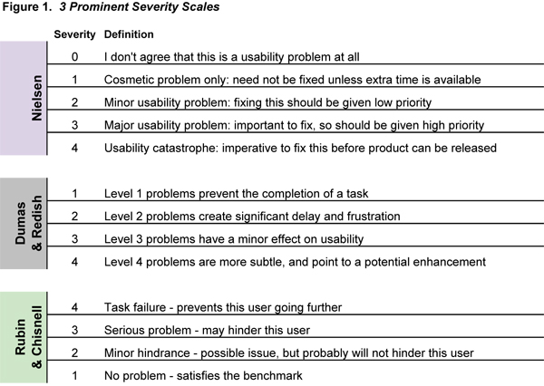
20 years ago Jacob Neilson in his article Severity Ratings for Usability Problems outlined the following 5 point scale:

0 = I don't agree that this is a usability problem at all
1 = Cosmetic problem only: need not be fixed unless extra time is available on project
2 = Minor usability problem: fixing this should be given low priority
3 = Major usability problem: important to fix, so should be given high priority
4 = Usability catastrophe: imperative to fix this before product can be released

Problem Prioritization in Usability Evaluation: From Severity Assessments toward Impact on Design

Severity Scales.xls

Effectively Communicating Usability Problems

UXValue as a tool for prioritize bugs

Making sense of usability findings with criteria based severity ratings

Usability Severity Rating – Improved


Icons need text labels

I’ve spent a great deal of time recently staring at ambiguous icons trying to guess their meaning and offer suggestions, it’s a fascinating study and mind numbing at the same time.

When designing icons for interfaces it’s important to note that a user’s understanding of an icon is based on previous experience. This came up recently when evaluating an interface’s usage of the checkmark symbol as a signifier of a change of state (in this instance selecting a photo). In my experience this has always signified completion or success when working through a task or a process, but it seems Apple and Google both are using this in entirely different contexts.

In her article “Icon Usability” Aurora Bedford argues that “due to the absence of a standard usage for most icons, text labels are necessary to communicate the meaning and reduce ambiguity”. I’m not sure this is possible in every instance but it’s a valid argument.

Icon labels should be visible at all times, without any interaction from the user. For navigation icons, labels are particularly critical. Don’t rely on hover to reveal text labels: not only does it increase the interaction cost, but it also fails to translate well on touch devices.

Via: Icon Usability


Real world design is often iterative – fail fast so you can succeed sooner.

Failing fast is one of those seemingly overly simplistic tenets that I often fail at achieving. Balancing perseverance (stubbornness) and the realisation that through failure we learn or succeed is often difficult to achieve.


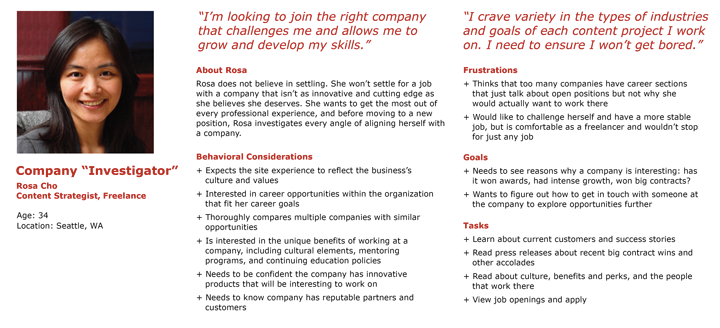
Persona definition

persona

From Aurora Bedford:

The field of user experience centers on the idea that we must design products around people, rather than teaching people how to use products: user-centered design (UCD), not technology-centered design. In order to do so, we must understand people—their behaviors, attitudes, needs, and goals. […]

A persona is a fictional, yet realistic, description of a typical or target user of the product. A persona is an archetype instead of an actual living human, but personas should be described as if they were real people.

The description should be thorough, including details about the persona’s needs, concerns, and goals, as well as background information such as age, gender, behaviors, and occupation. This focus on a singular individual—or a small set of individuals, if using multiple personas—fosters empathy for the specific users we are designing for, and helps us break away from the attempt to design for everyone. A persona doesn’t need to document every aspect of the imaginary individual’s life, but rather should focus on those characteristics that impact what is being designed. It is likely that a business will have several personas to cover the various aspects of their organization, with one or two of them identified as the main targets for each product or service, feature set, or content area of a website.

Common pieces of information to include are:

  • Name, age, gender, and a photo
  • Tag line describing what they do in “real life”; avoid getting too witty, as doing so may taint the persona as being too fun and not a useful tool
  • Experience level in the area of your product or service
  • Context for how they would interact with your product: Through choice or required by their job? How often would they use it? Do they typically use a desktop computer to access it, or their phone or other device?
  • Goals and concerns when they perform relevant tasks: speed, accuracy, thoroughness, or any other needs that may factor into their usage
  • Quotes to sum up the persona’s attitude

Via Personas Make Users Memorable for Product Team Members


In many ways, the most creative, challenging, and under-appreciated aspect of interaction design is evaluating designs with people. The insights that you’ll get from testing designs with people can help you get new ideas, make changes, decide wisely, and fix bugs.


To design is much more than simply to assemble, to order, or even to edit; it is to add value and meaning, to illuminate, to simplify, to clarify, to modify, to dignify, to dramatize, to persuade, and perhaps even to amuse.
Paul Rand